Mathematicians' relations and communities with each other
Using NetworkX, PageRank, and Graph visualization

Machine Learning Engineer at datachef.co
Introduction
Graphs have taken a lot of attention during the last years, from graph machine learning methods, including Graph Neural Networks, to Graph Databases. Even on Medium, people are posting graph articles more than before. One thing that I believe most data scientists underestimates is the power of graphs in visualization and storytelling.
Many see graphs as a complex and expensive solution for modeling data science problems. However, they still provide a great way to visualize data that no other chart or visualization can.
In this blog post, I will use the Mathematicians of Wikipedia dataset to investigate relations between mathematicians and their advisors using NetworkX to analyze and visualize.
What is NetworkX?
NetworkX is one of the most popular frameworks to work with. I think it is the scikit-learn of graph world! It is most probable to find NetworkX sooner than any other graph library when you start to learn about graphs and graph frameworks.
NetworkX provides many graph implementations, algorithms, and methods of analysis. Even though it is slow for many real applications, it still offers great functionalities worth learning.
Understaning the data
I have found the dataset from Kaggle. The table below demonstrates all the available features for this dataset that describes mathematicians. Note that the examples do not come from the same row.
| Column | Example |
| mathematicians | Johannes Hudde |
| occupation | ['civil engineer', 'engineer'] |
| country of citizenship | ['United States of America'] |
| place of birth | New York City |
| date of death | 1844 |
| educated at | ['Harvard University'] |
| employer | ['University of California, Berkeley'] |
| place of death | ['Paris'] |
| member of | ['American Mathematical Society'] |
| doctoral advisor | ['David Hilbert'] |
| languages spoken, written or signed | ['English'] |
| academic degree | ['Doctor of Sciences in Physics and Mathematics'] |
| doctoral student | ['Michael D. Morley'] |
| manner of death | ['natural causes'] |
| position held | ['member of the French National Assembly'] |
| field of work | ['number theory'] |
| award received | ['Fellow of the Royal Society'] |
| Erdős number | ['2±0'] |
| instance of | ['human'] |
| sex or gender | ['male'] |
| approx. date of birth | False |
| day of birth | 18 |
| month of birth | January |
| year of birth | 1711 |
| approx. date of death | False |
| day of death | 13 |
| month of death | March |
| year of death | 1787 |
The highlighted column names (mathematicians and doctoral advisor) are the columns in which I am interested in analyzing and showing how mathematicians are connected. So then, my first step is to load the dataset and clean it.
import pandas as pd
import networkx as nx
import matplotlib.pyplot as plt
import numpy as np

df = pd.read_csv('../data/data_cleaned.csv')
The first problem with the data is that many of its columns, including doctoral advisor, are a list of names embedded as a string. As I am only interested in the doctoral advisor column, I will only fix this column, but you can add the column names to the list_type_columns to fix it as well.
list_type_columns = [
    'doctoral advisor'
]

df[list_type_columns] = df[list_type_columns].fillna('[]')

for column in list_type_columns:
    df[column] = df[column].str.replace("'", '', regex=False)
    df[column] = df[column].str.replace("[", '', regex=False)
    df[column] = df[column].str.replace("]", '', regex=False)
    df[column] = df[column].str.split(',')

    df = df.explode(column)
Now that I have handled my dataset issues, including Null values, by replacing them with empty lists and fixing the string embedded list to real lists, I can save it to a CSV file to use later, so I won't need to process my dataset every time.
df.dropna(inplace=True)
df[['mathematicians', 'doctoral advisor']].to_csv('../data/adv.csv', index=False)
I only saved the columns I needed, including mathematicians and doctoral advisor.
PageRank Algorithm
PageRank computes the rank of each node based on the number of incoming edges. Google initially developed PageRank to calculate the importance of web pages.
PageRank works by counting the number and quality of links to a page to determine a rough estimate of how important the website is. The underlying assumption is that more important websites are likely to receive more links from other websites.
Using RankPage in NetworkX is really easy:
G = nx.DiGraph(nx.path_graph(4))
pr = nx.pagerank(G, alpha=0.9)
Graph Visualization has more insights
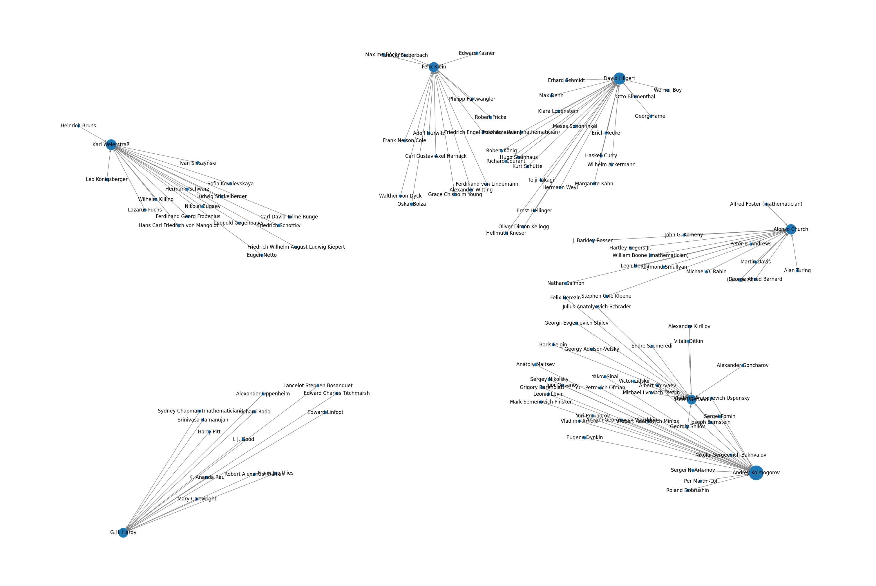
Now that we have loaded our dataset, cleaned it, and fixed its issues, let's see the top mathematicians with the most students.
top_ten_advisor = df['doctoral advisor'].value_counts().sort_values(ascending=False).head(15)
fig, ax = plt.subplots()
ax.barh(top_ten_advisor.index, top_ten_advisor.values)
ax.set_xlabel('Number of Students')
ax.axvline(x=13, c='red')
plt.show()
output:
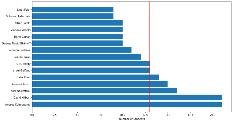
Even though the above image shows the most famous mathematicians and their students, it does not describe how they are connected and leaves lots of questions unanswered:
Are these top advisors connected by a shared student?
Are these top advisors also advisors of each other?
Do students also advise other students?
To address the questions above, a graph representation can help us. First, let's drop all the advisors with less than 13 students.
minimum_count = 13
df = df[df['doctoral advisor'].isin(df['doctoral advisor'].value_counts()[df['doctoral advisor'].value_counts() >= minimum_count].index)]
We create our graph in NetworkX and calculate the PageRanks ratings.
graph = nx.DiGraph()
graph.add_nodes_from(np.unique(df.values.flatten()))
graph.add_edges_from(df.values)

pr = nx.pagerank(graph)

names, ranks = zip(*pr.items())
pr_df = pd.DataFrame(data={'mathematicians': names, 'rank': ranks})
pr_df
Now that we have both graphs and ranks, we can draw.
fig = plt.figure(1, figsize=(30, 20), dpi=100)

pos = nx.spring_layout(graph, k=1.1*1/np.sqrt(len(graph.nodes())), iterations=20)
nx.draw(graph, node_size=pr_df['rank'].values*10000, with_labels=True, pos=pos, edge_color='gray')
plt.show()